We find pie charts everywhere—history, sociology; even sprinkled liberally over our newspapers. They are the darling of the mass media and a must-have in the business world. At the same time, they scarcely ever find their way into scientific literature and are being sidelined by elementary school curriculum. What is a pie chart, and what is it about pie charts that makes them such a controversial favorite?
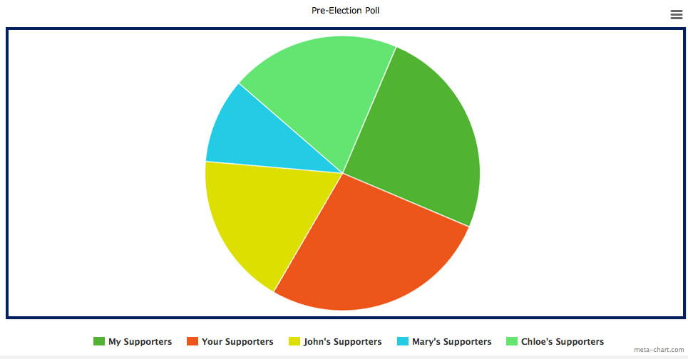
Put simply, a pie chart is a circular representation of statistical data—usually fewer than six categories—where the percentages are displayed as sectors of a circle; pieces of the pie. Here is an example of a pie chart which gives the reader information about the party loyalties of the voters in a small town:

The strength of a pie chart is that it offers the reader quick intuitively understandable information about the proportion of parts relative to the whole. A pie graph is not as good at displaying the relative size of sectors as its chief rival, the bar graph. But there is no representation of a whole on a bar chart at all, and to compare the size of a particular sector to the size of the entire thing you need to mentally superimpose all the bars on each other, and then mentally compare the length of your one bar to the length of that total. All that work for information that’s given you pre-digested on a pie chart.
The bar graph below offers the same information on party loyalties as the pie graph above, but notice how the emphasis on the relative sizes of the sectors rather than the part-whole relationship gives an entirely different perspective on Village X.

If that were the only difference between pie graphs and bar graphs it might be a toss up as to which was better; six of one, half a dozen and another. But there’s another problem with pie graphs as well. Research shows that we aren’t as good at recognizing the relative size of angles as we are at comparing length, so pie graphs are counter-intuitive to read. What’s even worse is that we estimate angles differently based on where they lie on the circle; and while we over-estimate obtuse angles we under-estimate those that are acute. That makes them very easy to use as a manipulative tool.
Here we’ve got two pie charts from meta-chart.com representing pre-election poll data in a class. The first has a 25% segment starting at a neat vertical line and taking up a definite quarter; and two other segments that are nearly-quarters, one a bit more, the other a bit less. It is easy to see from this graph what is more, what is less, and what the relative proportions are.

The second graph has exactly the same data, in exactly the same chart. The only difference is that it has been rotated by a small amount. In this second graph the differences between the three almost-quarters become very vague; any conclusions about which segment is 25%, which is a little more, and which is a little less are hardly more than guesswork.
Pie charts are best used for applications when you want to show percentages, or the proportion of parts to a whole, for a small number of parts where little differences don’t matter much. Small differences can be displayed on a carefully-made pie chart, but the average reader will skip over them unless they are labeled in an obvious way. Many sectors can be displayed, but they again require careful labeling and can give the reader an ‘information overload’ effect which counteracts the visually friendly character of your pie graph.
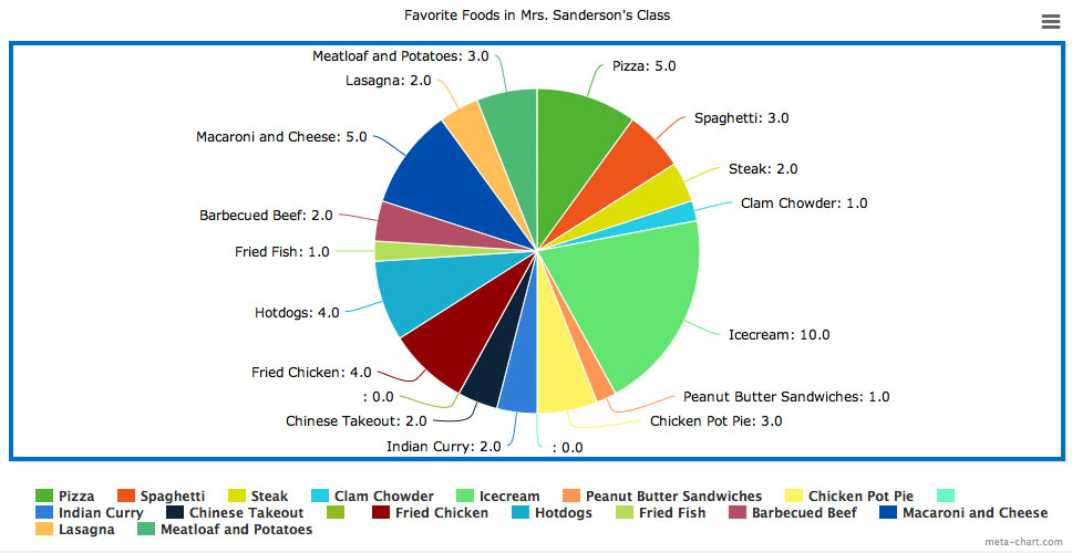
Take this example of favorite foods in a third grade class. You’ll notice that, though the graph is nice to look at, nearly all the information you get from reading the legend. This information could have been displayed just as well on a neat, concise list. The main take-away point your brain registers from the graphic is that a larger proportion of the class prefers ice-cream to any other food; a very small tidbit of information from a very large, cumbersome graph.
Still, pie graphs aren’t all bad. Used correctly, with an awareness of their limitations, they can deliver a certain amount of readily-digestible information that is easy for the layperson to understand. And, from a pedagogical standpoint, they are a wonderful way to explore fractions and part-whole relationships in multi-member sets.